Heirloom
- Role
- Design LeadiOS UI Engineer
- Duration
- 3 daysSep 2026
- Award
- 3rd PlaceMeta @ Hack GT
- Tools
- FigmaSwiftUIBackboardMongoDB
TL;DR
- The problem: Families are scattered, and elders’ stories disappear before anyone writes them down. Family-tree sites feel like forms, and shared albums become photo dumps.
- My role: Lead product designer and iOS UI engineer, and the team’s integration lead, over about three days at Hack GT.
- What I did: Designed every screen in Figma around physical keepsakes (a corkboard, polaroids, a bookshelf, a sepia globe), built them in SwiftUI, and got the whole app running on real phones.
- The outcome: A working iOS app that won 3rd place in Meta’s challenge, Bringing People Closer Together with AI, at a hackathon of 800+ participants and 200+ teams.
What is Heirloom?
Our app is designed to act as an archive for family heritage and culture, while also inspiring connection between distant family members in the present. A family-tree-like interface, a friendly record-keeping chatbot, and family notebooks make up the core of Heirloom. I led its design by creating in Figma and building its interface in SwiftUI, turning a feeling of home into a working iOS app.
Our trio built it at Hack GT in September 2026, where it placed 3rd in Meta’s challenge: Bringing People Closer Together with AI.
Why We Built It
The people who raise us shape our values and sense of self, but modern life has scattered families across cities, demanding careers, and generational divides. A group chat that wakes up only for birthday emojis offers the illusion of closeness, while irreplaceable oral histories quietly disappear.
Most people know little about their lineage past their grandparents, and elders’ life lessons often vanish before anyone writes them down. The tools that exist don’t help: family-tree sites feel like filling out forms, and shared albums become impersonal photo dumps.
We wanted to build the opposite: a space where family culture actually lives and grows.
My Role
Lead product designer and iOS UI engineer, and the team’s integration lead. My teammates built the voice agent, the archive AI, and the backend.
I designed every screen in Figma, then built it with Claude Code as my pair programmer: I set direction, reviewed each change, and tested on the simulator and my iPhone. The Figma MCP bridge carried each design into code, so its vectors, colors, and spacing arrived exactly as drawn.
- Build: Xcode, SwiftUI, MapKit, FastAPI, MongoDB Atlas, xAI Grok, Cloudflare Tunnel
Design Direction
The initial branding of the app was important to me. My team floated a more traditional, nature-inspired theme for a family-tree project, but I wanted an identity that was more unique and memorable. Before touching the UI, I spent time looking through color palettes, brainstorming names, and drafting a logo. We landed on a warm pink, purple, and tan palette to make the app feel comforting and homey, and a logo whose linked O’s represent intertwining family relations.
We carried that idea into our AI agent, Loomie, a ball of yarn that keeps in line with the multiple meanings nested within “Heirloom”: it’s meant to knit people together. Instead of questionnaires or cold text prompts, Loomie speaks aloud and listens like an attentive grandchild, latching onto sensory details, like the song on an old road trip or the smell of a childhood kitchen, to gently guide elders through their memories.
I designed Loomie’s presence around the home screen. The yarn ball sits raised at the center of the navigation bar, and tapping it softly blurs the photo board so the conversation appears on top as chat bubbles, keeping the family visible behind every story. A small status pill shows whether Loomie is listening, thinking, or speaking.
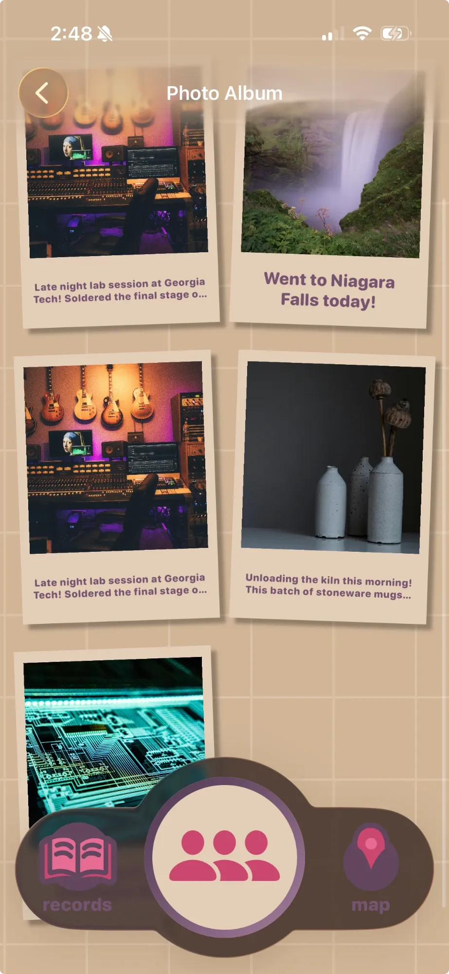
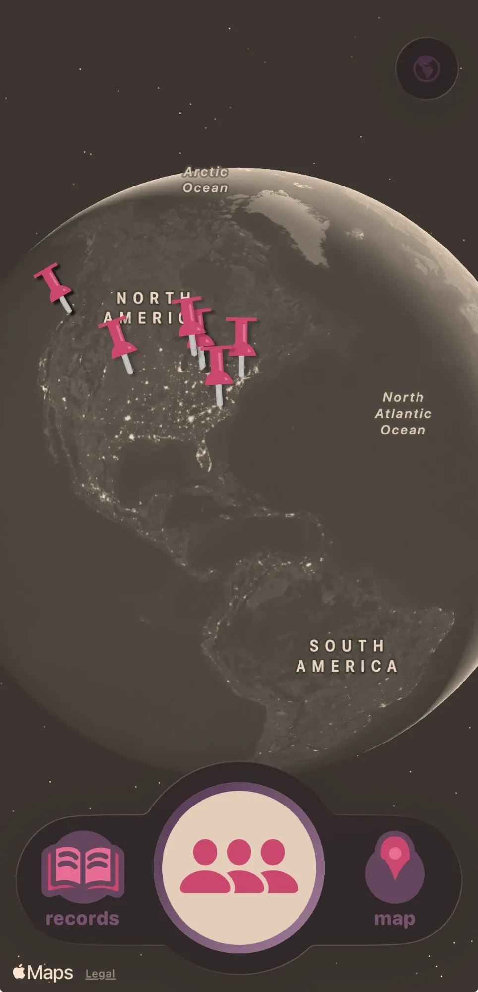
For the main interface, I chose a photo board over a traditional family tree. The strings connecting each photo echo the Heirloom theme, and family photos feel far more personal than a web of names. Pushpins recur throughout the app as a thematic object, standing out against the tan background. Finally, for the family records section, I designed an actual bookshelf, so keeping track of your history feels familiar and analog.
Sparks: Designing for Connection
Sparks are Heirloom’s answer to “why would a teenager care?” As stories come in, our AI agent synthesizes threads between generations based on their story and history data, like a great-grandfather’s mechanical tinkering relating to a granddaughter studying engineering today. Each spark arrives as a notification with a prompt: call the relative, or ask Loomie for more.
We looked at one pertinent user story in particular:
- Grandpa Joseph gets a notification from Loomie: “Alex started his first day of college today. Share what your first day of college experience was like.”
- He tells Loomie about his first day, and the story is saved to the family archive.
- A spark alert connects Joseph’s story to his grandson Alex, who is starting college.
- “Give a Call” dials Joseph directly.
Heirloom doesn’t just replace human interaction with an AI chat. Instead, it is simultaneously a family archivist and an encouraging connector in motivating distant family members to interact with each other.
Outcome
Heirloom ended as one working iOS app that feels the way we hoped: a warm place where a grandfather’s story becomes a pinned polaroid, a thread to his grandson, and a reason to call. My Figma designs, the team’s voice and AI work, and a shared family archive run together on real phones. Out of 200+ teams, it placed 3rd in Meta’s challenge: Bringing People Closer Together with AI.
What I contributed:
- The product’s visual language and every screen’s design, from the corkboard and twine to the sepia globe and bookshelf
- The SwiftUI implementation of those designs as reusable, animated components
- The experience design of Sparks
- The integration, backend, and performance work that got it running for the demo
What I Learned
- Metaphor carries emotion. Choosing the “woven” theme over a minimalistic chart or even a nature theme did a lot for the unique identity and comforting feeling of the app. Everything else followed from that one idea.
- Visual communication is integral. During the judging process, several judges commented on how the design brought our app concept together. We strived to make our demo video easy to follow visually with little intrusive narration, to ensure that our UI and app intent was intuitive.
If we kept going: real family photos in place of the illustrated portraits, read status tracked per person, and API keys moved off the phone before sharing builds more widely.
← back towork