
Pulse: For Research
- Role
- DeveloperDesign Lead
- Duration
- May–Jul 2026
- Collaborators
- Team of 4
- Tools
- SwiftUIFigmaPreactFastAPI
TL;DR
- The problem: Duke’s health-research app depended on participants opening it daily, but gave them no reason to.
- My role: Design lead and developer on a team of four sophomores in Duke’s Code+ program, over 10 weeks.
- What I did: Set the app’s visual direction, designed its engagement system (a Tamagotchi-style pet tied to daily streaks, plus goals that earn badges I illustrated), built goal setting in SwiftUI, and designed a secure admin portal for moderating the social features.
- The outcome: A tested, iterated prototype that’s continuing toward a production release. Along the way, I raised concerns about student art being used for AI training, which led to design-policy changes for future Code+ students.
The Problem
Life-saving health research moves slowly. At institutions like Duke, every new study can mean another round of costly, time-consuming IRB approval before any data is collected. Dr. Amanda Randles and the Duke Center for Computational and Digital Health Innovation (DCCDHI) came up with a way around it: a health app that collects wearable data from consenting participants into one shared, de-identified pool that researchers at many institutions can draw from.
There was a catch. On iOS, the background tasks that collect that data only keep running if people actually open the app. The original app offered basically no reason to come back, so the whole research pipeline depended on an engagement problem nobody had solved yet.
My Role
Design lead and developer on a team of four Duke sophomores, over a 10-week summer (May–July 2026) in Duke’s Code+ program. I owned the app’s visual direction and gamification system, built the goal-setting feature in SwiftUI, and designed and co-developed the admin web portal.
The Question
One question drove the whole project: why would someone actually want to keep using this app? As design lead, I felt that this is a motivation backing a majority of our work, and so it shaped every decision that followed.
Our team scoped four features around it:
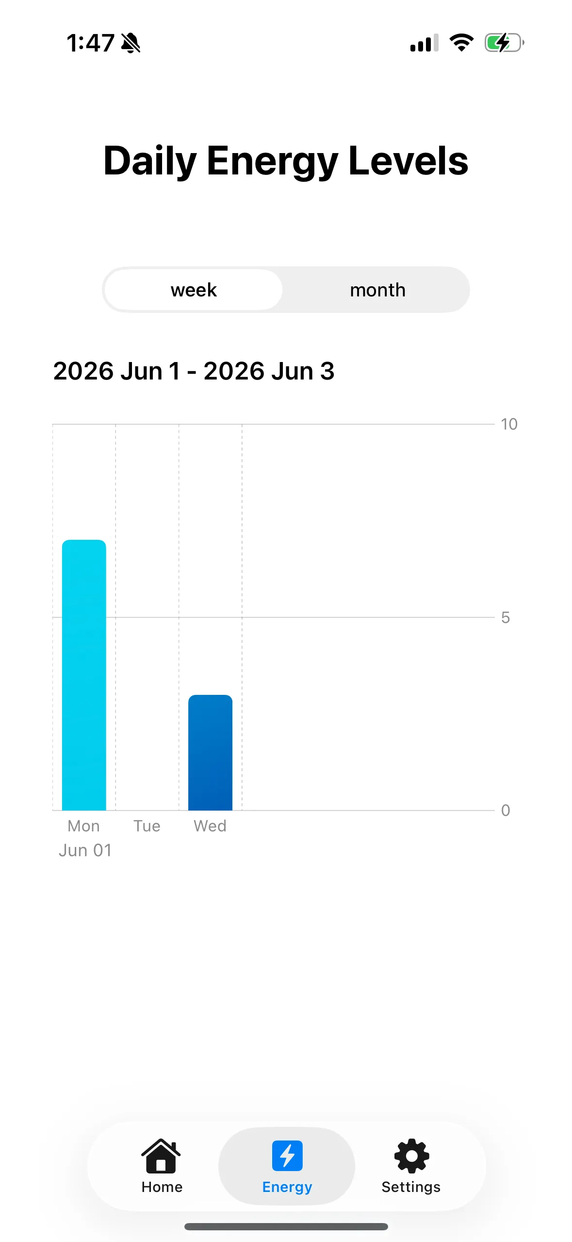
- Meaningful health metrics: For an app centered around health data, allowing users to simply understand and make beneficial decisions based on their trends is crucial.
- Duke Recreation, in one place: Duke Rec’s classes and fitness events were scattered across a confusing collection of websites, which made them hard to find and sign up for. Pulse pulls from the Duke Rec API and gathers every sign-up in one place, then sends you straight to the right registration page. It’s a Duke-specific feature, and a practical reason to open the app.
- Gamified check-ins and fitness goals
- Social features: so participants can connect with each other.
Together they make Pulse an all-in-one place to keep up with your health, connect with others, and get rewarded for showing up. That consistency is exactly what the research needs.
Designing From a Blank Canvas
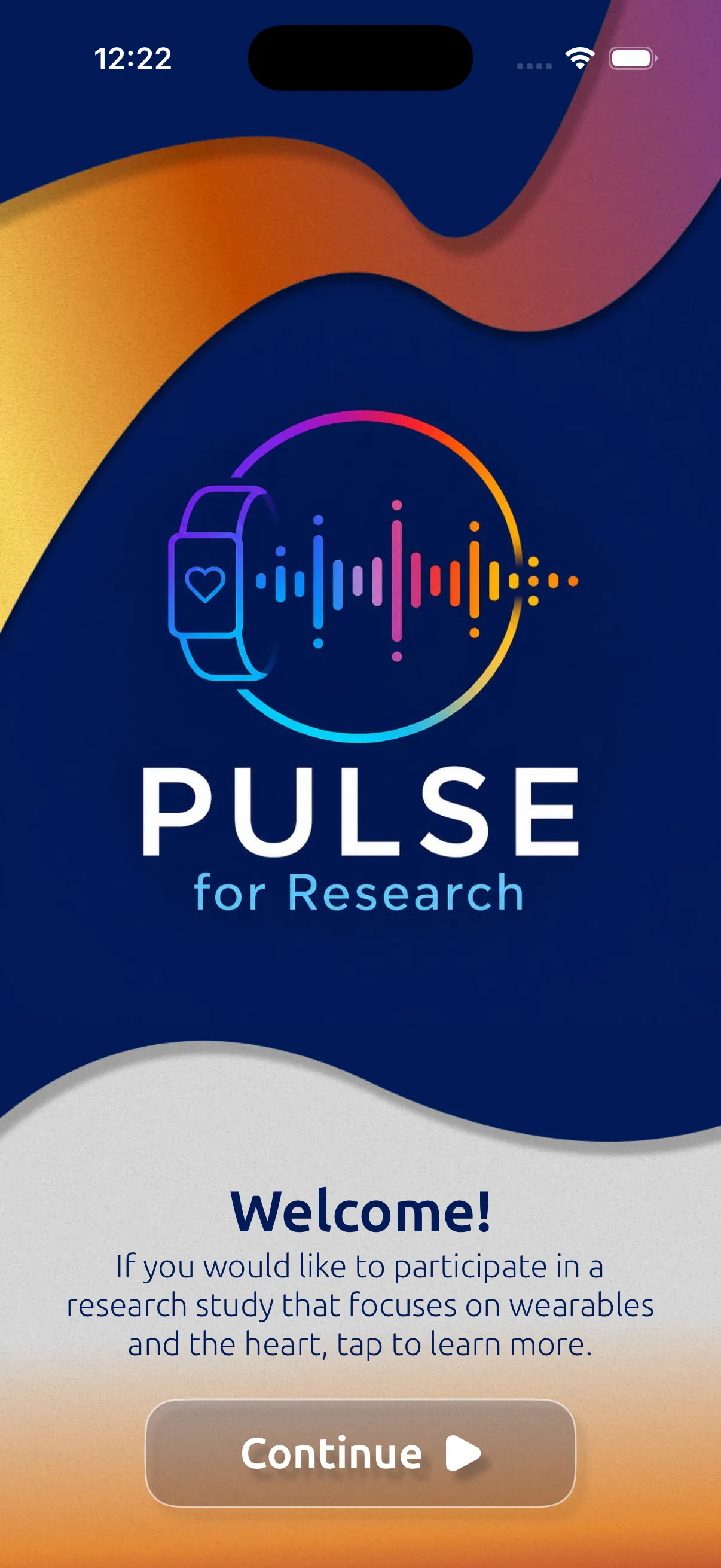
The original app had minimal functionality and no real visual design, which meant I was starting almost from scratch. I built the design system around DCCDHI’s existing brand identity, so the app still reads as a credible Duke research tool. I then combined that with some more playful and fluid elements, so it feels like something you’d open on your own and not just a study you signed up for.
Making Engagement a Habit
I took charge of the heart of the engagement strategy: gamification. Before designing anything, I looked at how habit-forming apps like Duolingo keep people coming back. The pattern that kept showing up was the streak: a small daily commitment that feels costly to break.
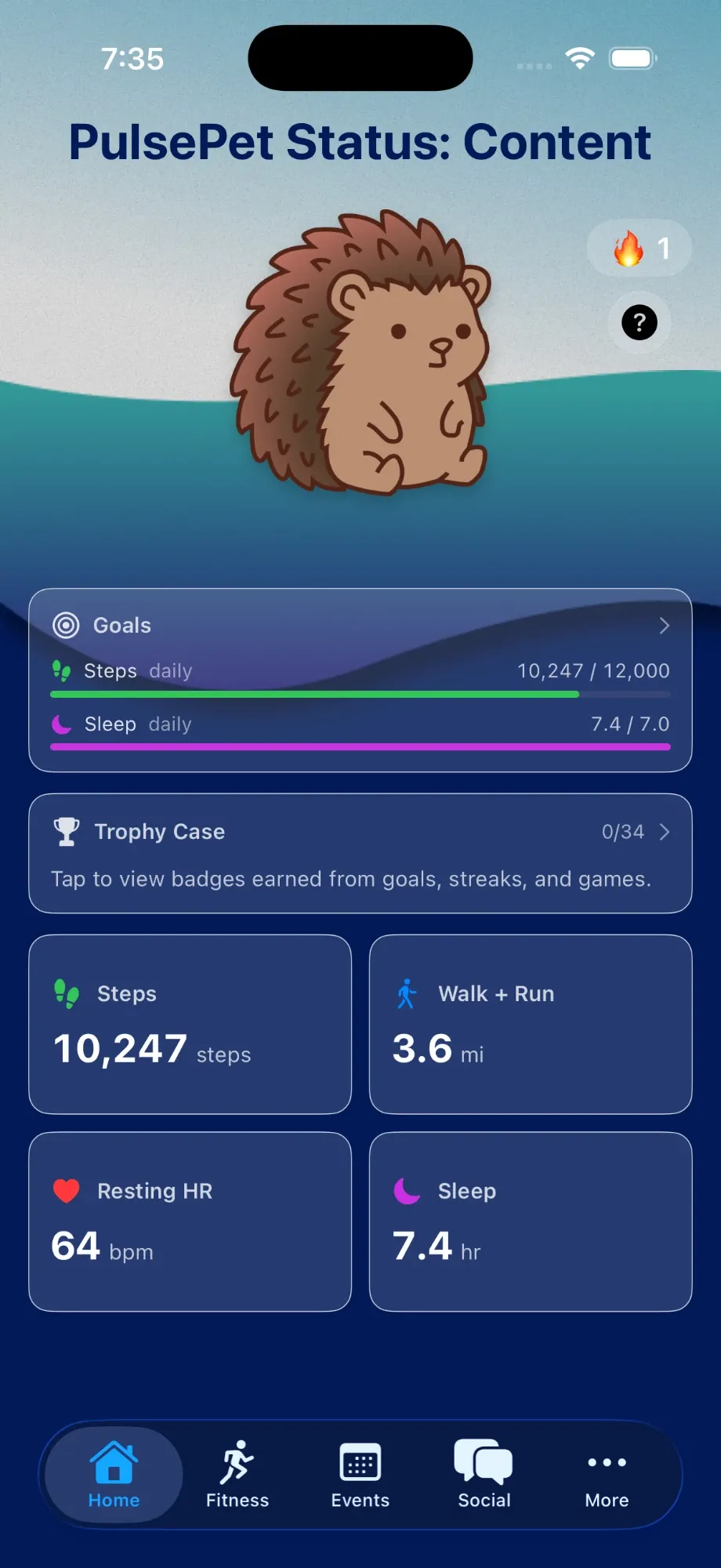
So I tied the streak to something people would care about. Participants choose a Tamagotchi-style pet, and its health rises and falls with their daily check-in streak. Skip a day and your pet feels it. That turns an invisible requirement (open the app so data can sync) into something personal.
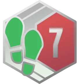
Streaks bring people back daily, but I also wanted to implement longer-term retention. I built a goal-setting feature that turns the metrics participants already track, like steps, distance and sleep, into daily or weekly targets. Hitting a target earns a badge. I illustrated the full badge set, tiered by category and milestone, so new users get early wins and dedicated users always have something further to chase.
































Keeping the Community Safe
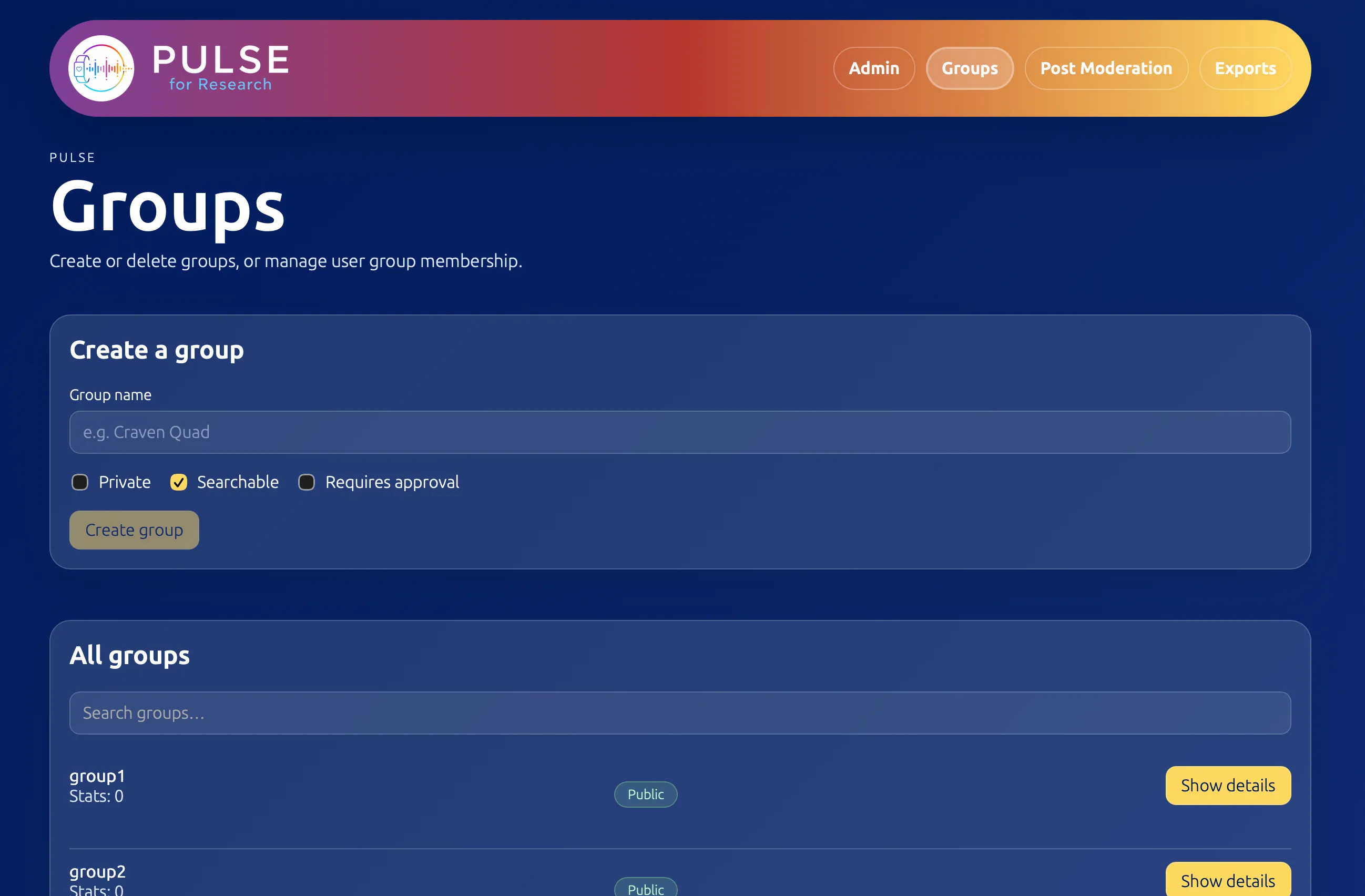
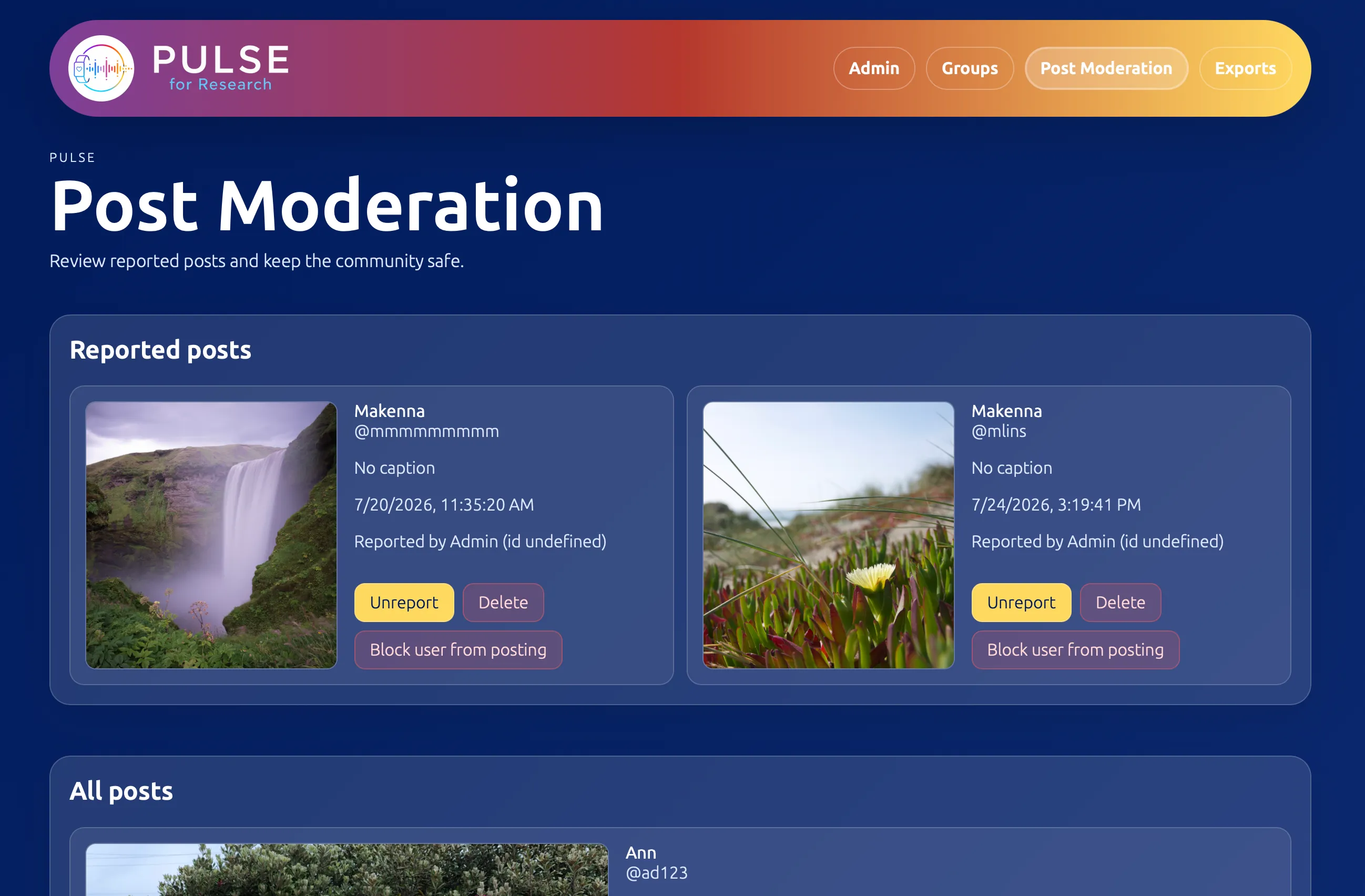
Social features create a responsibility, especially in a university-affiliated research app. Research staff needed a way to moderate posts and groups without touching code, so I designed a minimal admin website that matches the app’s design language, and helped build it. We put it behind Duke’s Shibboleth login and containerized it with Docker, so only authorized administrators can reach the moderation tools.
Looking Ahead
Toward the end of the project, we ran some preliminary UI/UX testing, which gave us a window into smaller fixes we could make right away and larger-scope tasks for future iterations.
We finished with a solid prototype that will keep being iterated on toward a production release. With more time, I’d polish the designs further and innovate more unique icon sets and motion designs beyond some of Apple’s generic SwiftUI features we utilized for this timeframe. A more custom component set would make the design more cohesive and easier to carry over to an Android release.
Some of my impact reached past the app itself. I raised concerns within Code+ about how the work students make, especially original art, could be used for AI training. That conversation led to changes in the program’s design policies for Code+ students in years to come.
← back towork